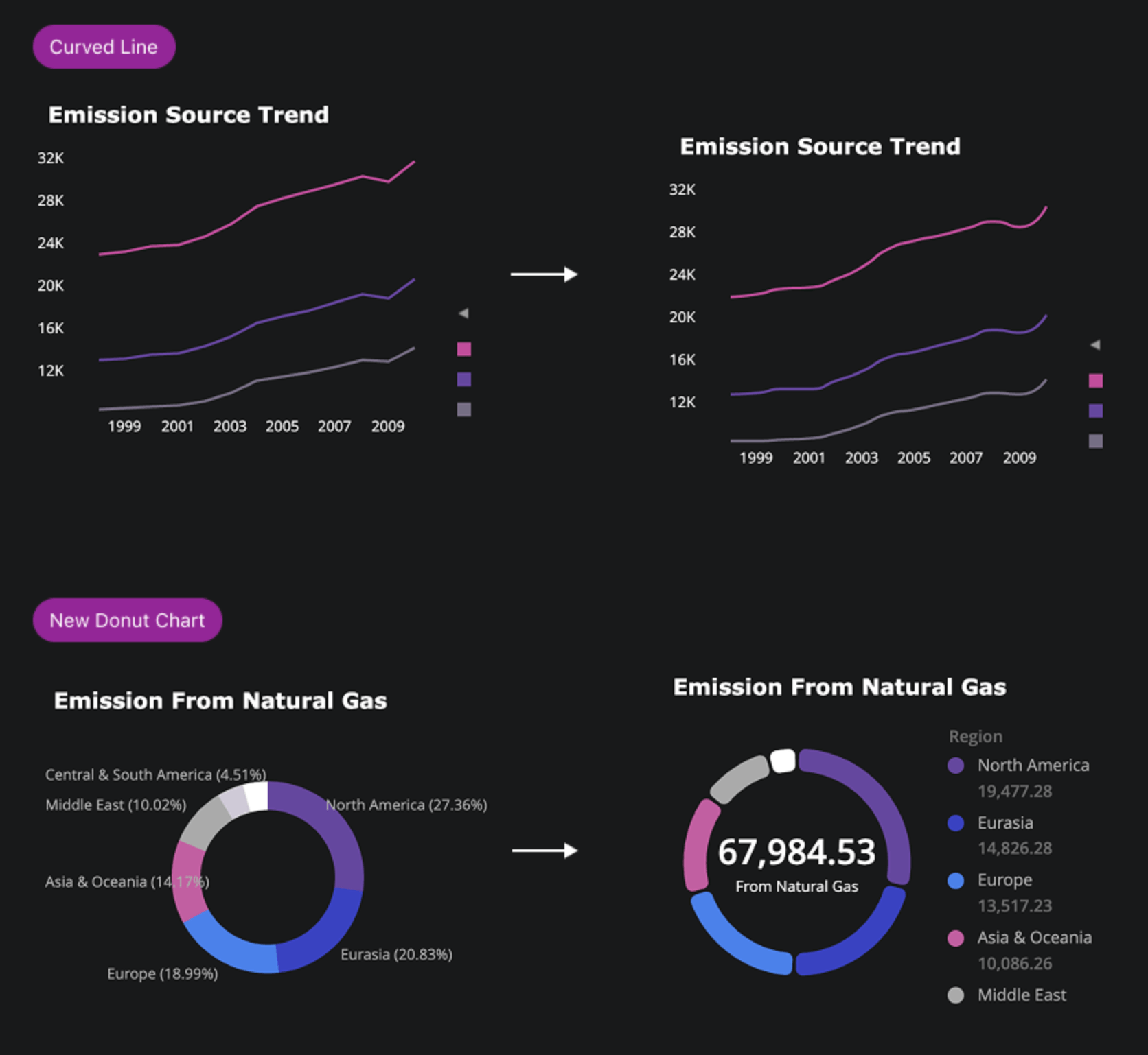
Visualization Enhancements: Modern Donut and Curved Lines
Elevate your dashboards with enhanced visual appeal and clarity. Enjoy the new Donut chart featuring rounded edges, sleek legend placement, and flexible KPI displays for more beautiful, readable insights. Legends can now display slice values and support interactive selection. Plus, bring a modern, designer-chosen look to your analysis with smooth curved lines for Line, Area, and Combo charts, as well as enhanced color gradient support. These updates offer a contemporary, intuitive experience across Library Web and Workstation—helping users create stunning, high-impact visualizations effortlessly.
Read the full product documentation here.