Responsive Design with Strategy - How to Leverage Dashboard Features to Boost User Experience and Increase User Adoption by 66degrees
Discover how to utilize advanced dashboard features to improve user experience and drive user adoption through strategic, responsive design.
Introduction
Responsive design is a hot topic, but why is it so crucial?
At 66degrees, we believe that a seamless user experience across devices directly impacts user adoption and, ultimately, a company's bottom line. A 2018 McKinsey study, "The Business Value of Design," revealed that companies prioritizing design saw nearly double the revenue growth of their industry counterparts.
This success stems from increased accessibility and readability, which are cornerstones of responsive design, allowing users to effortlessly consume information on any device.
Know Your Audience, Design with Purpose
Before diving into design, understanding your audience is paramount. Rarely can you create an effective solution without a) understanding your end users' capabilities and needs and b) understanding the desired business outcomes from the insights your dashboard is meant to provide. This knowledge informs your design strategy, revealing how users will interact with the content, which in turn will guide the dashboard’s development and subsequent testing.
Basic questions to get to know your audience:
- Who are the end users? How experienced are they in analyzing and interpreting data insights?
- What are the 5 most important questions to be answered in this dashboard?
- What are the common themes? Can I group information by them?
- What device types will be utilized to consume the developed content?
- How will the end user interact with the dashboards on different devices? Will multiple device orientations be supported?
These questions will help clarify significant components of the design process. Encourage open communication with your audience, guiding them through brainstorming sessions and influencing expectations with your knowledge of the Strategy platform capabilities. The sessions with your users will clarify important design considerations, such as whether you will take advantage of free form dashboard layouts, or whether your design should build in flexibility for both large and small aspect ratios across different device types. Most importantly, leverage the input of your end users to ensure you are creating flexible designs that align with your users’ business priorities.
Leveraging Key Features for Responsive Dashboards
Strategy dashboards offer inherent responsiveness advantages over alternative dashboarding tools. However, without careful design and testing, the goal of providing users with a flexible, multi-device capable dashboard may fall short.
Plan ahead! Using audience insights and your design expertise, you can create compelling, responsive dashboards that work seamlessly across devices and screen sizes! Here is how you can utilize key features and concepts in Strategy to accomplish these goals:
Free-form Layout
By default, Strategy dashboards will resize to fit an end user’s device, and the default dashboard build experience allows for rapid creation through structured, resizable tiles. A differentiator for Strategy, however, is the ability to enable a Free-form layout, which allows for incredible flexibility in how and where dashboard elements are organized on the screen. This allows for limitless options to structure your visual narrative, while adhering to company branding requirements or audience guidelines.
Using free-form layouts, here are a few tips to enhance the design:
- Group elements by section. Consider grouping by primary KPIs, content category, or level of granularity.
- Prioritize mobile designs (mobile-first, if applicable). Prioritize mobile in initial designs and avoid any pop-ups unless extremely necessary. Starting a Report design with mobile can prevent usability issues and speed up both design and development time. It is easier to expand width and redistribute elements than trying to adapt larger screen elements into smaller screens.
As a best practice, pop-ups are best suited for web reports, and depending on the pop-up panel height it might automatically add a vertical scroll to the mobile view which can impact the overall user’s experience in a mobile device and lead to fat fingering.
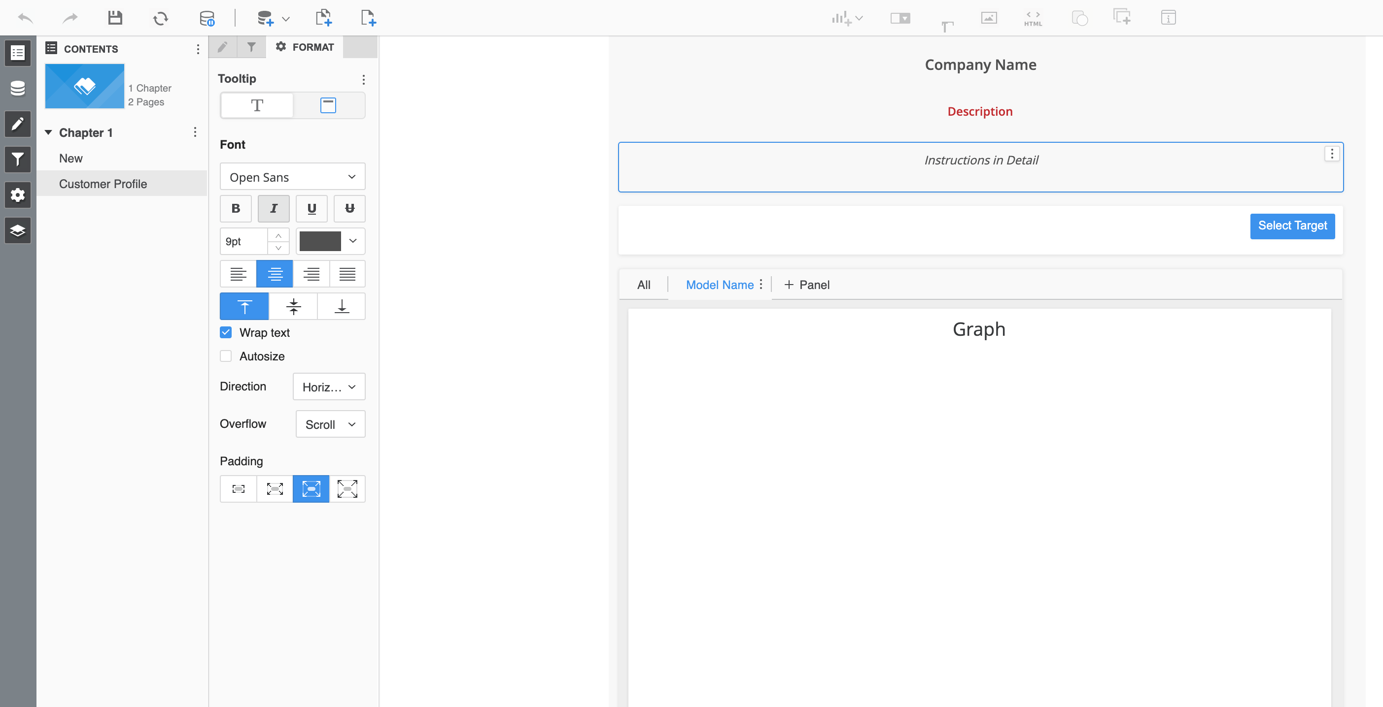
Figure A: Information Window with double vertical scroll in responsive view
- Calculate elements using proportions. The free-form layout has a canvas that is based on percentages, not pixels. When defining the dimensions of each object, calculate the proportions of them for consistency.
For example, if the width is 100% and the padding is 2% and I need to showcase four KPI tiles, then do the following math:
100% (total width) -10% (2% multiplied by 5) = 90% of available space.
Which means that I have 22.5% for each KPI tile width if I want to size them proportionally.
Here is an example of the percentage calculation and how the object is displayed in a dashboard when using a free-form canvas:
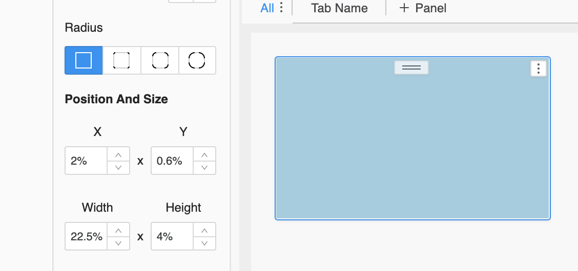
Figure B: A shape box created with the proportions based on the percentage calculation.
- Maintain consistent page height. For large dashboards, ensure each page has the same pixel height to maintain consistent proportions of headers, titles, and KPIs across the entire dashboard.
Please see example below:
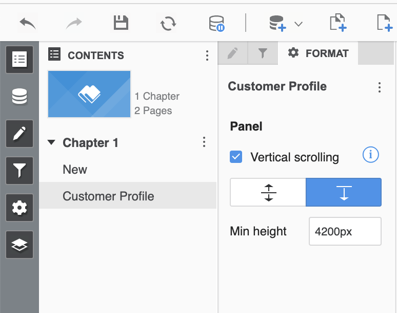
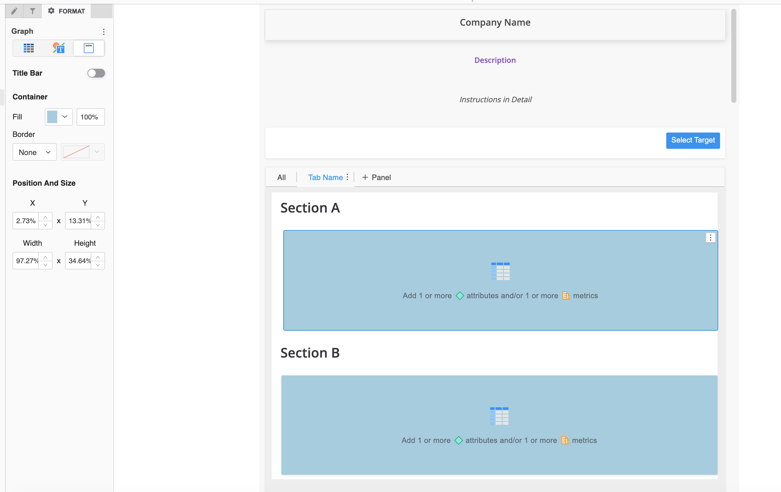
Figure C: A page within the same chapter with 3000px of height

Figure D: A page within the same chapter with 1000px of height with the exact same content as the one with 3000px
Visualization Titles vs. Using Text Box Titles
Elements such as panel stacks, grids, and graphs will contain the ability to display a title for each object by default. However, if company guidelines or UX standards dictate specific spacing or padding, default titles might not offer the needed flexibility. In such cases, you can disable the visualization title and use a text box element instead, allowing for precise control over percentages and spacing.
Figures E and F below illustrate examples of when an objects default title is initially enabled and then when it is also disabled to allow the flexibility of using a text box to achieve the desired look and feel based on an initial design or expected layout:
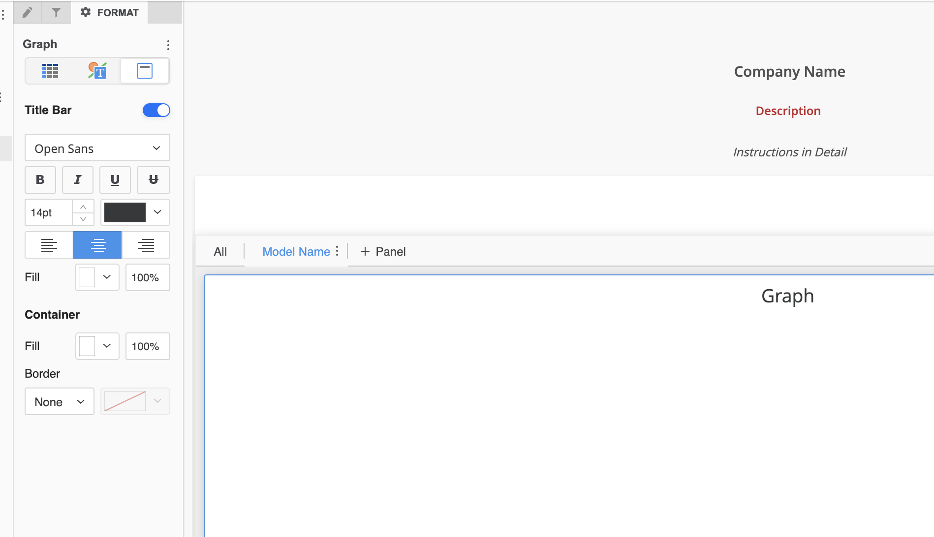
Figure E: The default Title is enabled.

Figure F: The default Title is disabled, and a text box has been added to display the Title. This enables the text to be aligned as the user sees fit and ensures equal spacing with other elements.
Pro Tip:
Anytime text boxes are used in a responsive dashboard, ensure that the text boxes have a large enough width set to avoid text being cut off on smaller screens or unintended scrolling being introduced due to text wrapping. Expand your textbox and add extra padding to maintain legibility and allow intentional text wrapping (without scroll bars) on tablets and smaller devices.
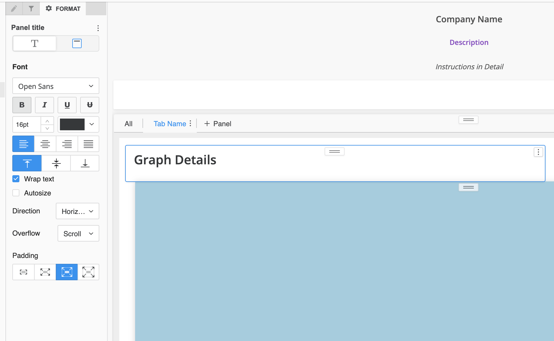
Figure G: Text box with limited space with vertical scroll in responsive view
Working with Shapes
Shapes are like a Swiss army knife when it comes to enhancing visual appeal. They can provide better ways to frame your content. You can recreate header titles, color coding, and even manually developed legends to enhance your design. Shapes can also be used as a mechanism to manipulate responsive features of a dashboard.
Here we are going to expand on our earlier example used within the free-form layout based on the percentage for a shape. After determining the appropriate space as discussed earlier; create a shape with the appropriate proportions.
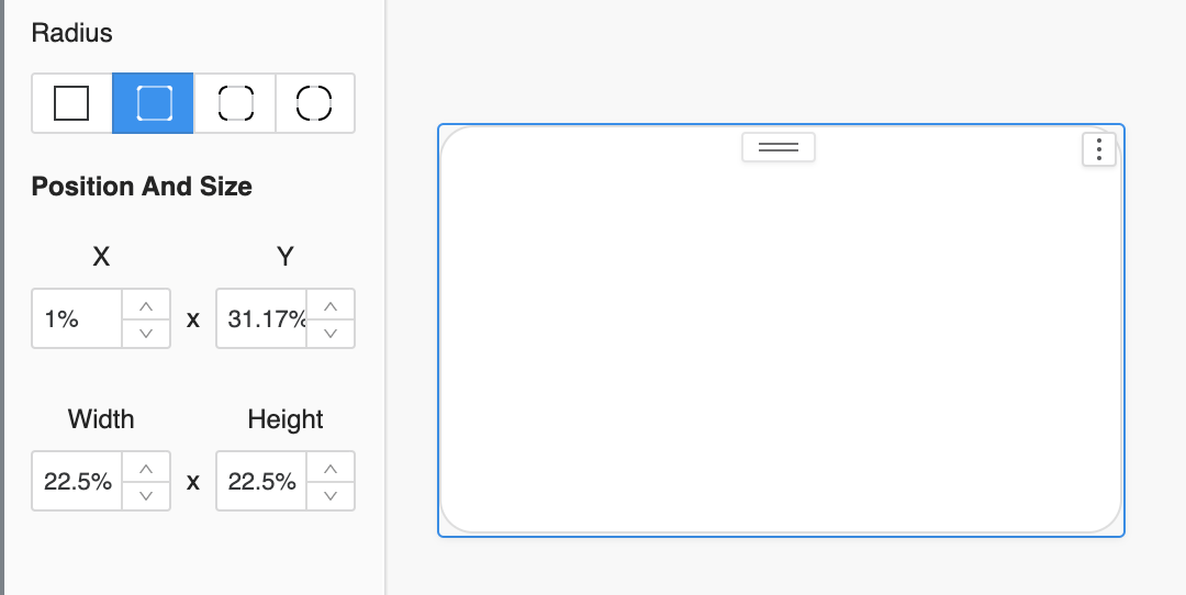
Figure I: A shape box created with the proportions based on the percentage calculation.
Copy and paste the shapes and distribute them near the original. In this example these could be four different KPI visuals. This could be helpful when creating KPI tiles that do not fit the standard visualizations gallery, for example a KPI tile with two thresholds.

Figure J: Duplicate the shapes and spread them across the width. Select them all and right click to distribute them horizontally
Once you distribute the shapes, you now have a row which you can now include values within to display 4 KPI’s.

Figure K: Review alignment and shape boxes percentages for consistency.
Working with Images
Images can change your look and feel instantly by adding a remarkably simple touch to enhance your design. They can be used to add final changes, such as custom branding or a company logo inserted as an image. The most powerful ways images are used typically will visually provide a meaning without any verbiage being required.
When using images in different instances, it is crucial that you keep the original visual aspects. We will further discuss formatting options which can be applied to avoid any distortion of an image.
Pro Tip:
Avoid using images unless they serve a specific purpose, such as iconography or directions including specific instructions. Since dashboards are structured on a percentage base, there is a certain limit that images can be stretched to fit a given display. It is helpful to ensure images are set to “Lock aspect ratio” to avoid distortion.

Figure L: Example combination of shapes, text, and image.
Fit Options for Images
- Fixed to - Can be commonly used for consistency among a larger dashboard.
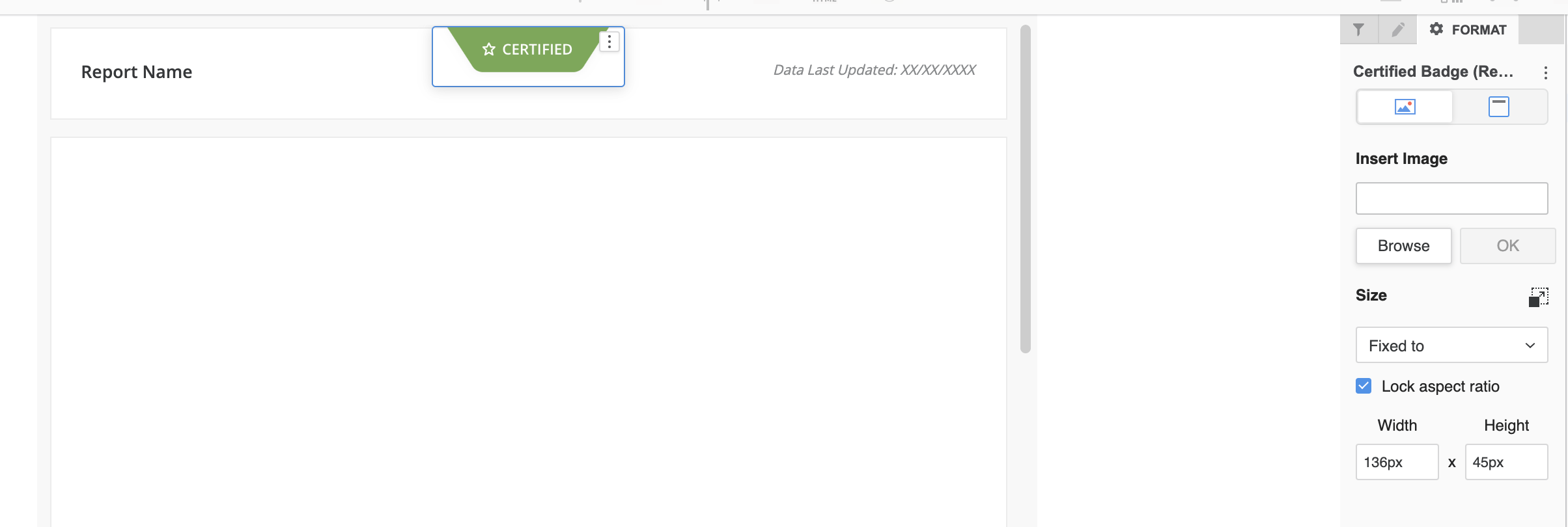
Figure M: Example of image set as “Fix to” in the web view.
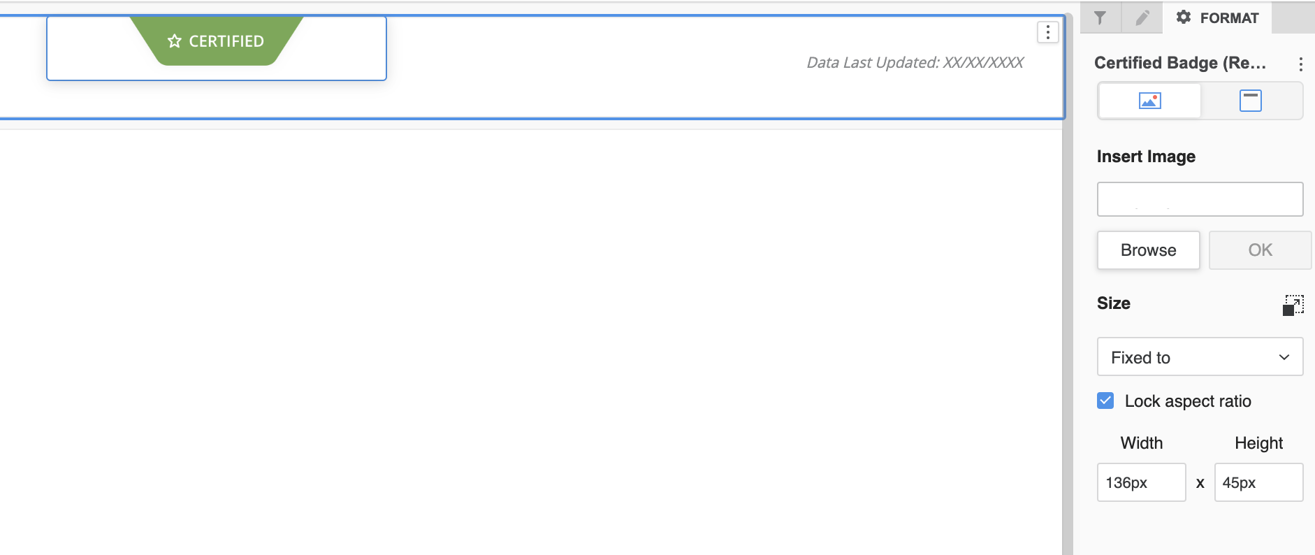
Figure N: Example of image set as “Fix to” in the responsive view.
- Fit to Container - A great option to be used when leveraging multiple dimensions in a use case such as desktop, tablet, mobile into one.
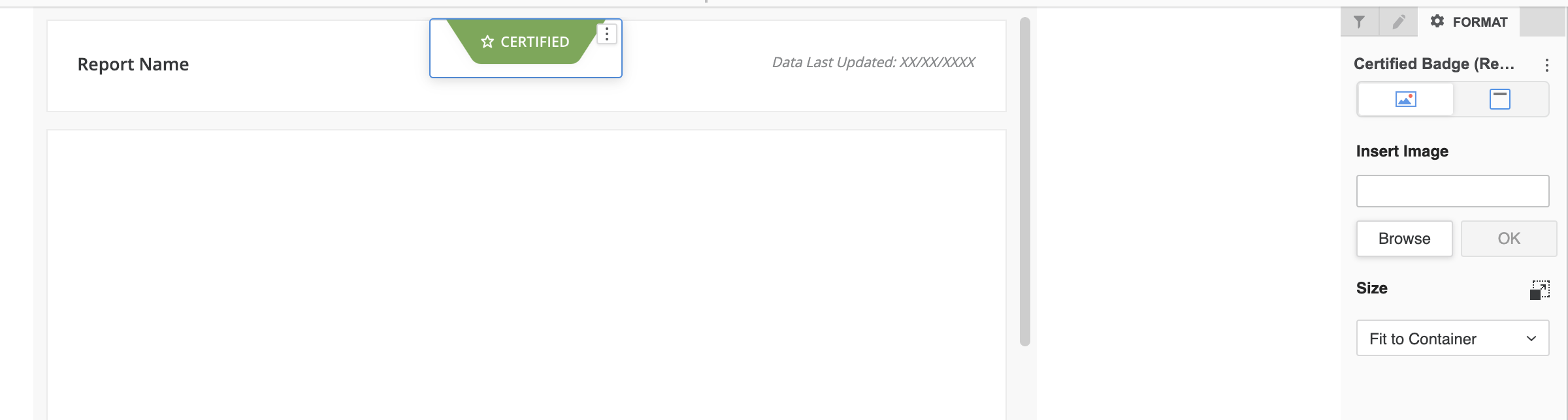
Figure O: Example of image set as “Fit to Container” in the web view.
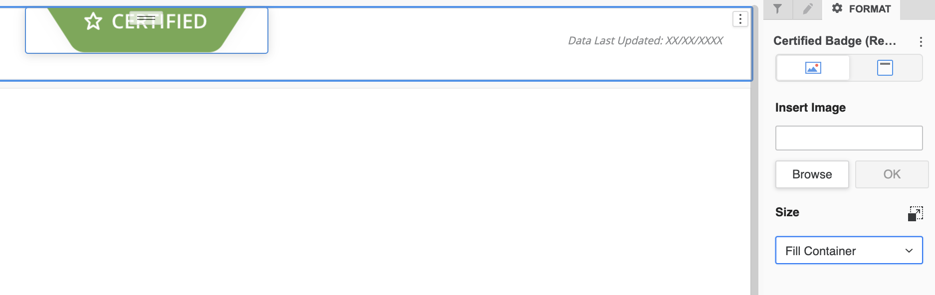
Figure P: Example of image set as “Fix to Container” in the responsive view.
- Fill Container - If your image has a padding that can be used for specific use cases, this is a good option to adapt based on the proportions without distortions. It will make sure all objects scale to the same proportions.
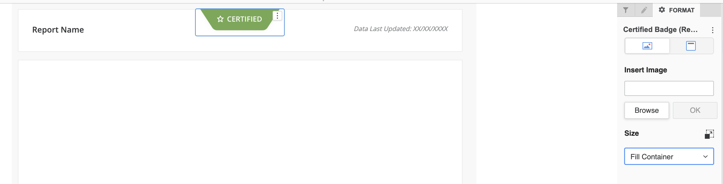
Figure Q: Example of image set as “Fill Container” in the web view.

Figure R: Example of image set as “Fill Container” in the responsive view.
- Stretch - This option can be handy when using images in large resolutions and then stretching them to different sizes based on your device size. But this could distort the image which is being used and if that is the case, please test one of the 3 options above to determine what best fits your design.
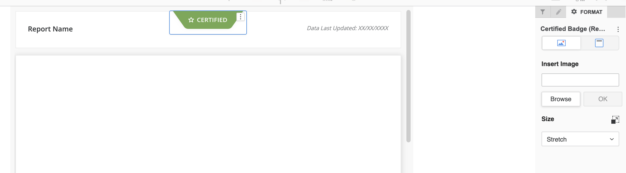
Figure S: Example of image set as “Stretch” in the web view.
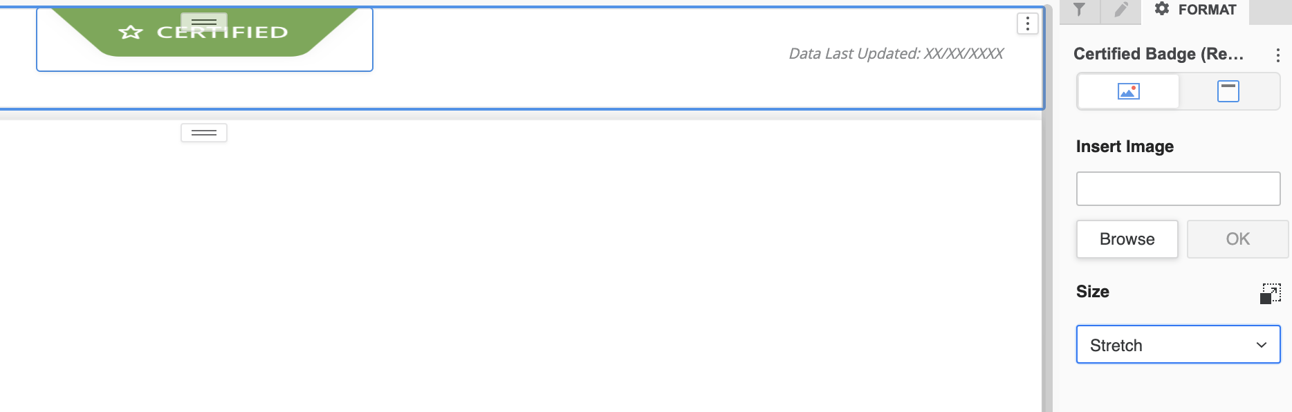
Figure T: Example of image set as “Stretch” in the responsive view.
Pixel vs Percentage Based
As mentioned previously, dashboards are percentage based while images use pixel dimensions. Here are some tips to keep in mind:
- Use images cautiously to avoid distortion.
- When designing the free-form layout, give some priority to flexible elements such as shapes since they can adapt proportionally to screen dimensions.
- Maintain consistent page height across all pages for consistent proportions.
Grouping Elements
From the perspective of designing for Strategy responsive dashboards, element grouping is perhaps the most important tool in a developer’s toolkit! Through intentional grouping of elements, the desired layout can be preserved and prevents random responsive layouts when displayed across different devices.
Here is how the elements look without any grouping.
In this example, Section A and B are grouped separately under a panel.
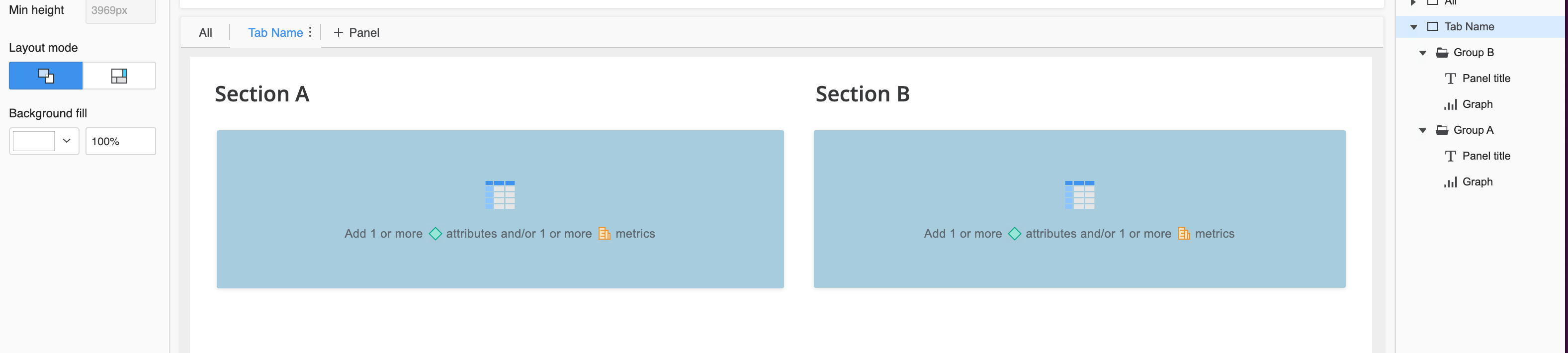
Figure U: Example of grouping in the web view 1
The result in the responsive view will display them broken down into separate groups, which means that they will not be seen side by side.
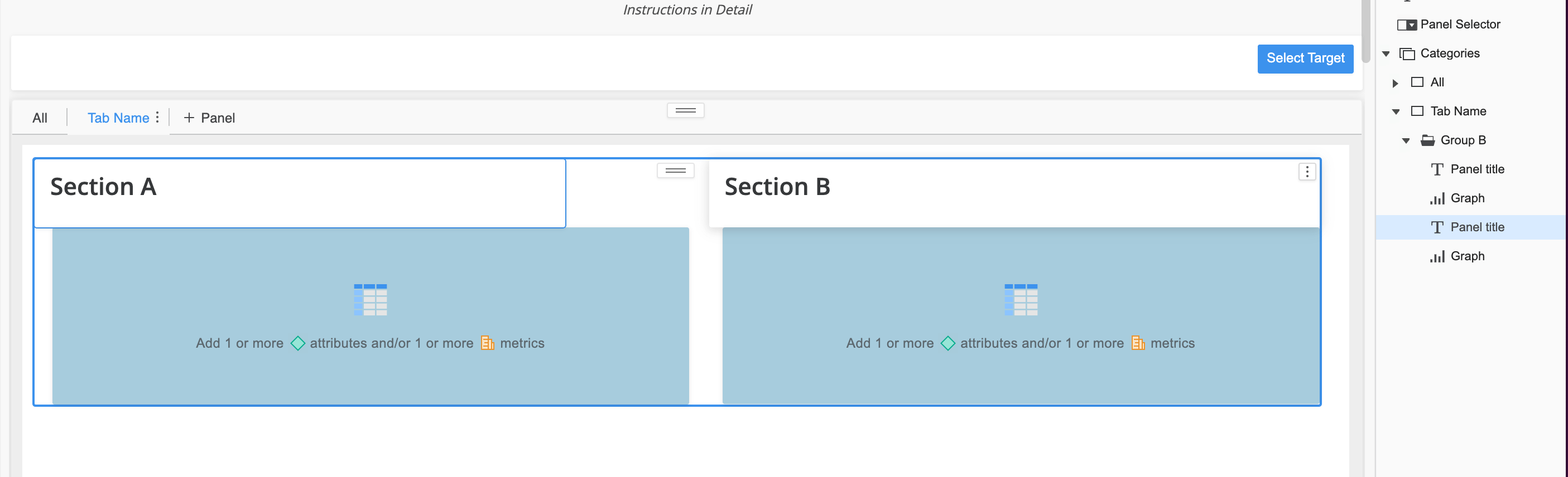
Figure V: Example of grouping in responsive preview 1
In this example, Section A and B are grouped all together, which influences how the breakpoint will be established in the responsive view.
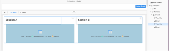
Figure W: Example of grouping in the web view 2
The result in the responsive view will have the objects grouped together; it will be considered a single element and will adapt the visualizations width to fit into a single row displaying them exactly as in the web view.
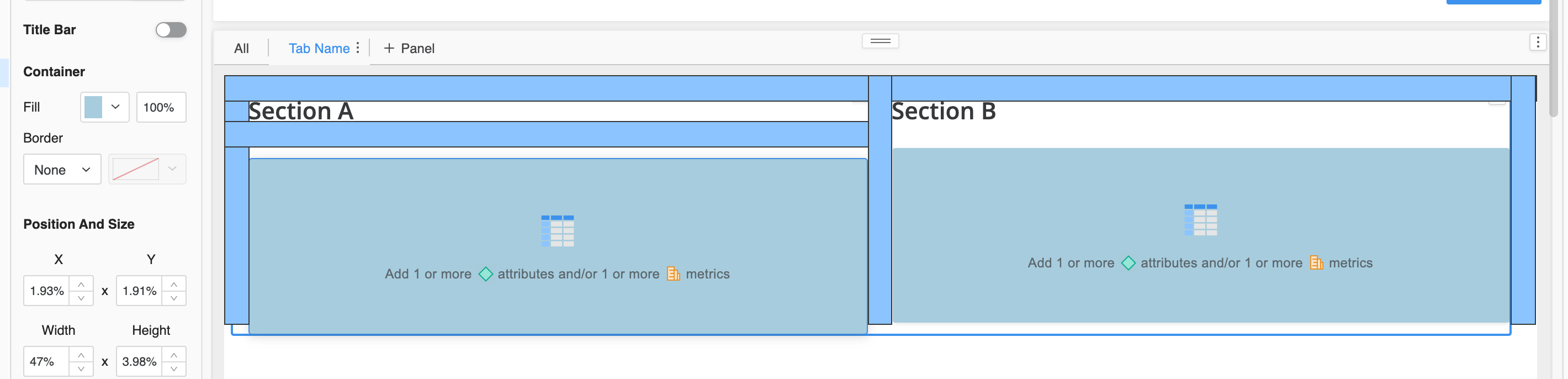
Figure X: Example of grouping in responsive preview 2
Pro Tip:
Use grouping to organize the content and identify the outliers that might need custom treatment such as titles vs text elements. It will help you to identify objects which can be grouped to reduce redundancy and display the content in a way that aligns with your intended design.
Testing for Responsive Design
Testing throughout the build process is crucial, but dedicated testing is essential for validating responsive design. Set realistic expectations, as perfect responsiveness across all devices can be challenging. However, thorough testing, guided by your audience's prioritized device list, helps achieve a desirable responsive experience.
Testing Considerations:
Compile a list of common resolutions for all use cases (e.g., specific iPhone and iPad models, common web resolutions)
In Web, test always in preview mode for both Full View and Responsive View.
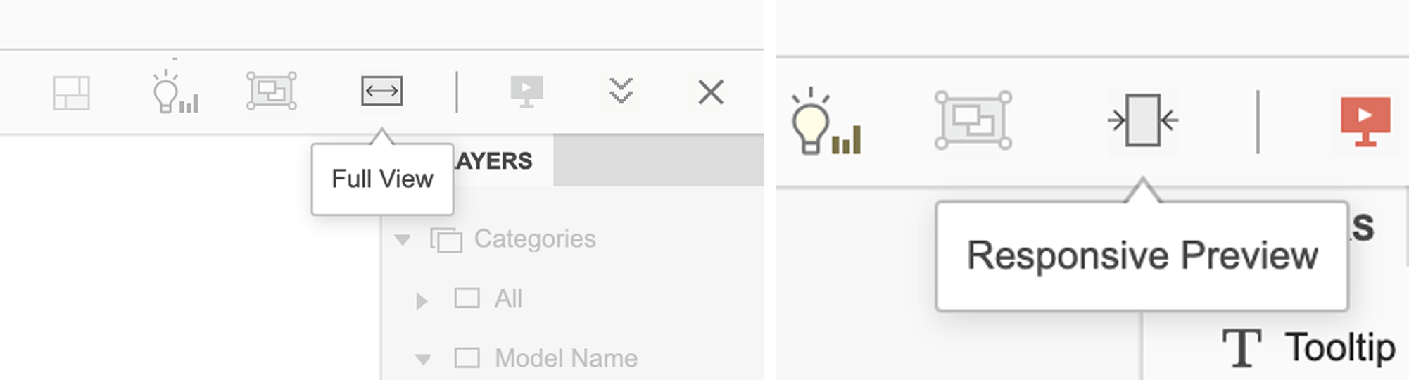
Figure Y: Full view displayed & Figure W: Full view displayed
Use Chrome developer tools and the “Inspect Elements” feature with the device toolbar enabled. This can be handy during testing to simulate different screen sizes and see how the dashboard behaves
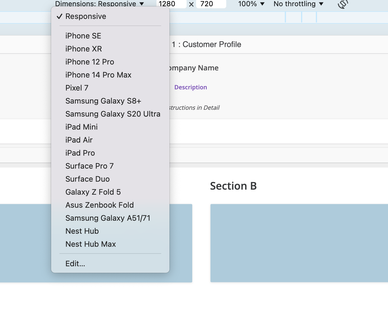
Figure Z: Inspect element active
Remember that while developer tools provide a preliminary assessment, testing on actual devices is crucial for comprehensive validation.
Thorough testing will ensure that even if you are able to fit all content in all devices; it then gives you the opportunity to optimize the look and feel during testing to ensure all elements are fully organized and legible in all intended scenarios.
UX/UI Benefits
By following these tips, you will enhance dashboard consistency and achieve the desired responsive design. Partnering with a UX designer is highly recommended. They can identify design gaps during testing, assist with theme structuring, and ensure alignment with user needs and UX best practices.
Conclusion
There’s no exact recipe for creating a dashboard with desired responsiveness in every build. Though the key areas we have discussed can be used as ingredients to a flexible responsive design. To start with “Knowing Your Audience & Design with Purpose” as it will drive your priorities. Then by “Leveraging Key Features” your responsive design will come to life. Lastly, with “Testing” and the use of a “UX/UI team” the opportunities are endless in optimizing your build.
In addition, here’s a few “Do’s” and “Don’ts” which can be referenced along with the concepts we’ve discussed.
Do’s:
- Use shapes
- Use text elements
- Use lines
- Use panel stacks
- Name your layers
- Group your layers
- Test, test, test
Don’ts:
- Use background images
- Export text as images
- Leave layers ungrouped
- Test only on the web
- Test only in a few resolutions
- Test in portrait or landscape mode only when developing for mobile devices
While achieving a truly flawless responsive design in Strategy may require a degree of thoughtfulness beyond just rapid visualization prototyping, the strategies and techniques outlined in this post provide a solid foundation for success. By thoughtfully implementing these approaches, you can create dynamic and user-friendly dashboards that adapt seamlessly to any device, enhancing user engagement and driving broader adoption of your analytics solutions.
.jpeg&w=750&q=75)
Poliana Branti
Poliana Branti is a UX Leader with 16+ years of experience, including 10+ years focused on BI Tools and SaaS platforms. With a detailed understanding of the latest trends in BI architecture and UX design, Poliana holds several certifications and has been working with Strategy since 2015.
Related posts

In the ever-evolving world of business intelligence, blending AI technology with design thinking has become a game-changer for crafting effective dashboard solutions.

Keng Fu Chu
March 12, 2024
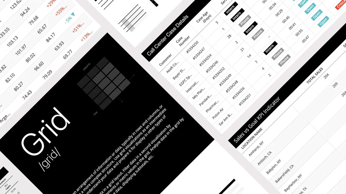
Working with data is fun! Recently I found myself obsessed with MicroStrategy’s grid tool. A grid is an essential element of data analysis. Information is arranged in rows and columns, presented in a range of possible configurations from basic and straightforward to fairly complex.
Keng Fu Chu
March 16, 2022